- Title: コイカツ! / Koikatsu Party
- Release Date:
- Developer:
- Publisher:
Information about コイカツ! / Koikatsu Party is still incomplete. Please help us fill the details of the game using this contact form.
Your custom characters are truly beautiful, and it’s important to share their beauty with the world. Taking good pictures of them can sometimes be a bit challenging if you’re not sure where to start. While I’m not an expert, I can certainly offer you some beginner tips to help you capture better screenshots in Koikatsu Party or any game with a photo mode.
Introduction
It’s completely natural to have a strong affection for the characters you’ve created. We often develop a deep attachment to these characters, attributing them with unique personality traits and turning them into more than just mere images. They become fully-fledged individuals in our minds. However, the challenge lies in conveying the entirety of these characters to others, rather than just presenting a superficial appearance. To accomplish this, we use pictures to showcase what we love about our custom characters. If you’re not well-versed in techniques related to posing, emoting, photography, or art, you might inadvertently convey the wrong impression about your character. I’ll provide you with the basic and even some intermediate techniques that can breathe life into your pictures. These techniques include:
- Gaining a better grasp of emotions and how to portray them through your character’s facial expressions and body language.
- Understanding the fundamentals of both larger and smaller muscle groups, and how to utilize them to make your poses more dynamic and natural, steering clear of a mechanical look.
- Recognizing the main focus of each shot and learning how to naturally guide the viewer’s attention to where you want it to be.
- Grasping the concept of framing and its impact on the overall mood and vibe of your picture.
Chapter 1: Creating Facial Expressions with More Human-Like Qualities
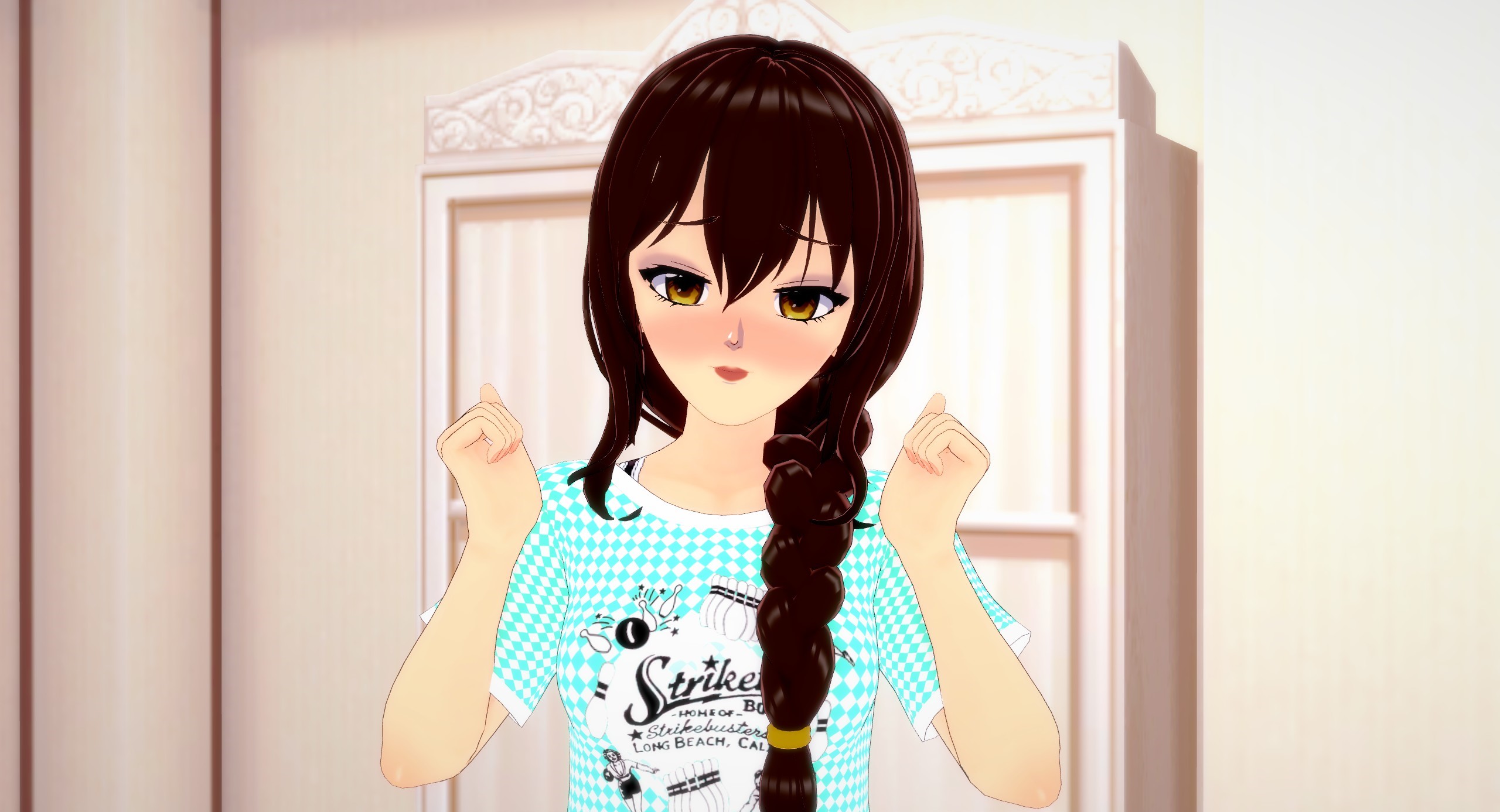
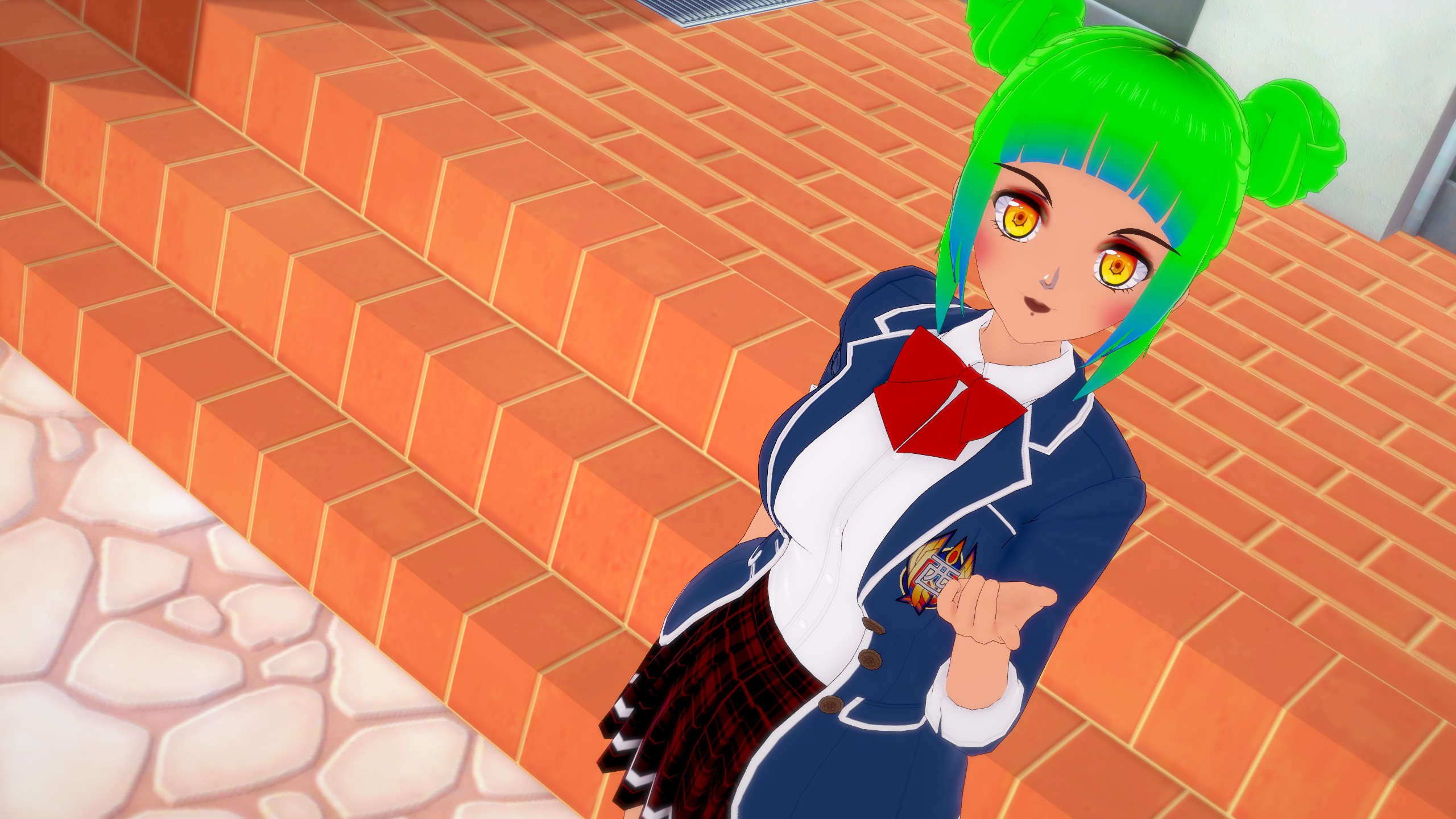
In the following sections, I’ll be utilizing a custom character as a model to illustrate the various concepts and techniques we’ll be delving into. In this instance, let’s start by considering a simple objective: making our character appear joyful. To expedite the process, we’ll begin with a pre-made pose that conveys happiness, complete with a default facial expression.

The way your character’s expression comes across can range from uninteresting to unsettling. This is due to the immediate impact your images have on viewers, evoking certain thoughts or feelings. For instance, your character’s lively pose combined with a neutral or even serious facial expression creates an uncomfortable dissonance. This lack of clear emotion triggers a feeling of unease, often referred to as “The Uncanny Valley.”
To enhance the situation, let’s delve into the solution. The key lies in comprehending the exact emotion you wish to convey through your character’s appearance. Precision matters here because, artistically speaking, saying “She’s happy” is rather vague. Instead, we should ask: what’s the source of her happiness? How intense is this joy? By narrowing down these specifics, we can achieve a more effective portrayal.
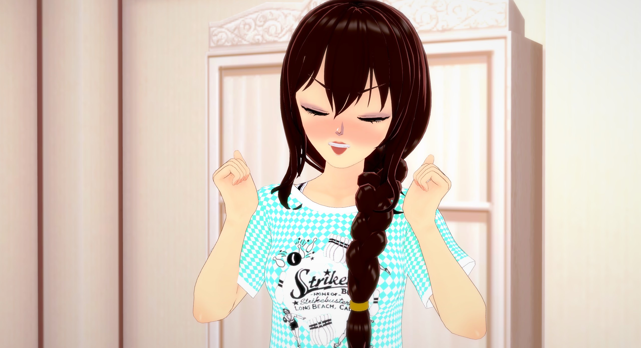
In this case, you aim for an ecstatic, exuberant expression. Imagine that she’s just encountered something incredibly adorable, and her heart is brimming with delight. So, let’s begin with the adjustments, starting from the top – her eyebrows.
I selected a slightly anxious eyebrow expression because if you observe images of individuals experiencing immense happiness, their eyebrows often appear more apprehensive or concerned. This phenomenon occurs because our facial features tend to bunch up and contort significantly when we’re overwhelmed by any emotion, as a way of effectively conveying the intensity of what we’re feeling. But, let’s not deviate too far from our current topic. Let’s transition to discussing the eyes.
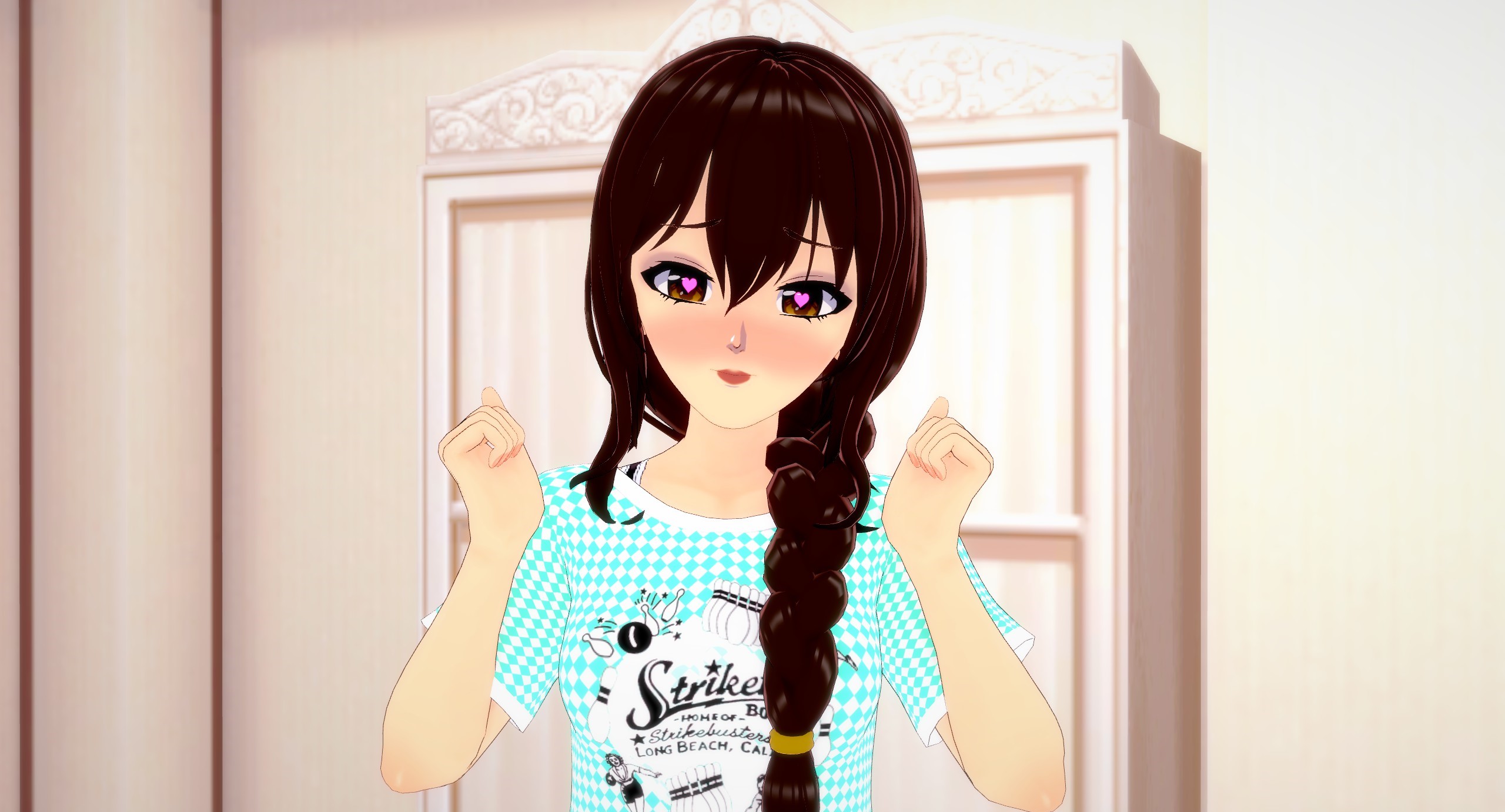
Once more, we’re opting for a more tightly gathered appearance for her eyes, departing from her initial relaxed expression. While the heart symbols certainly contribute to the portrayal of emotions, the squinted nature of her eyes gives the impression that she’s struggling to handle the intensity of her feelings. Moving on to the mouth.
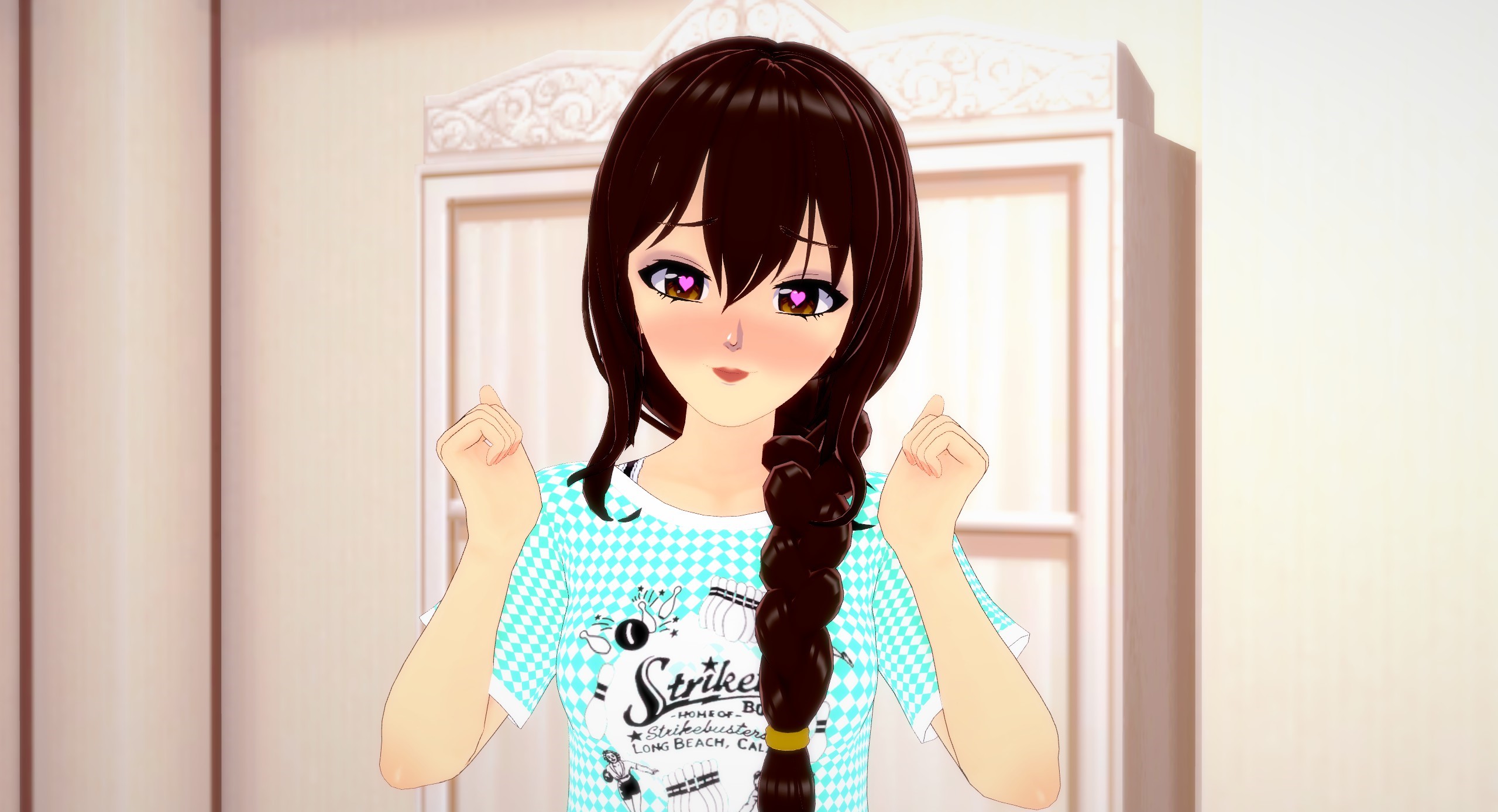
The current image bears a striking resemblance to the previous one, which indeed presents an issue. The depiction lacks sufficient expressiveness, especially considering the emotion we’re aiming to convey—ecstasy. To address this, let’s enhance her expression with a broader and more open smile.
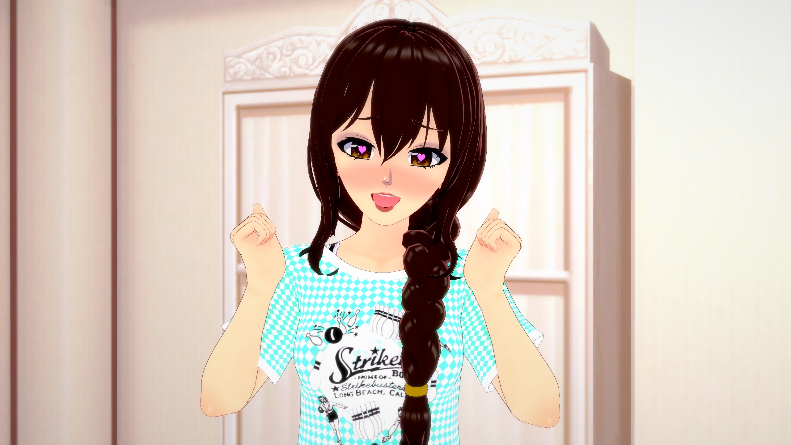
It’s quite an improvement from where we began, don’t you think? This positive change is due to the fact that each aspect of the body contributes to conveying emotions. As a result, we need to consider the message conveyed by each body part individually and in conjunction with others. To illustrate, let’s examine the situation where I replicate the same pose we used to make her appear extremely happy. However, this time, we’ll alter her facial expression.
Indeed, now she appears quite frustrated, doesn’t she? To achieve a more nuanced effect, let’s modify only the eyes and mouth in comparison to the original picture.
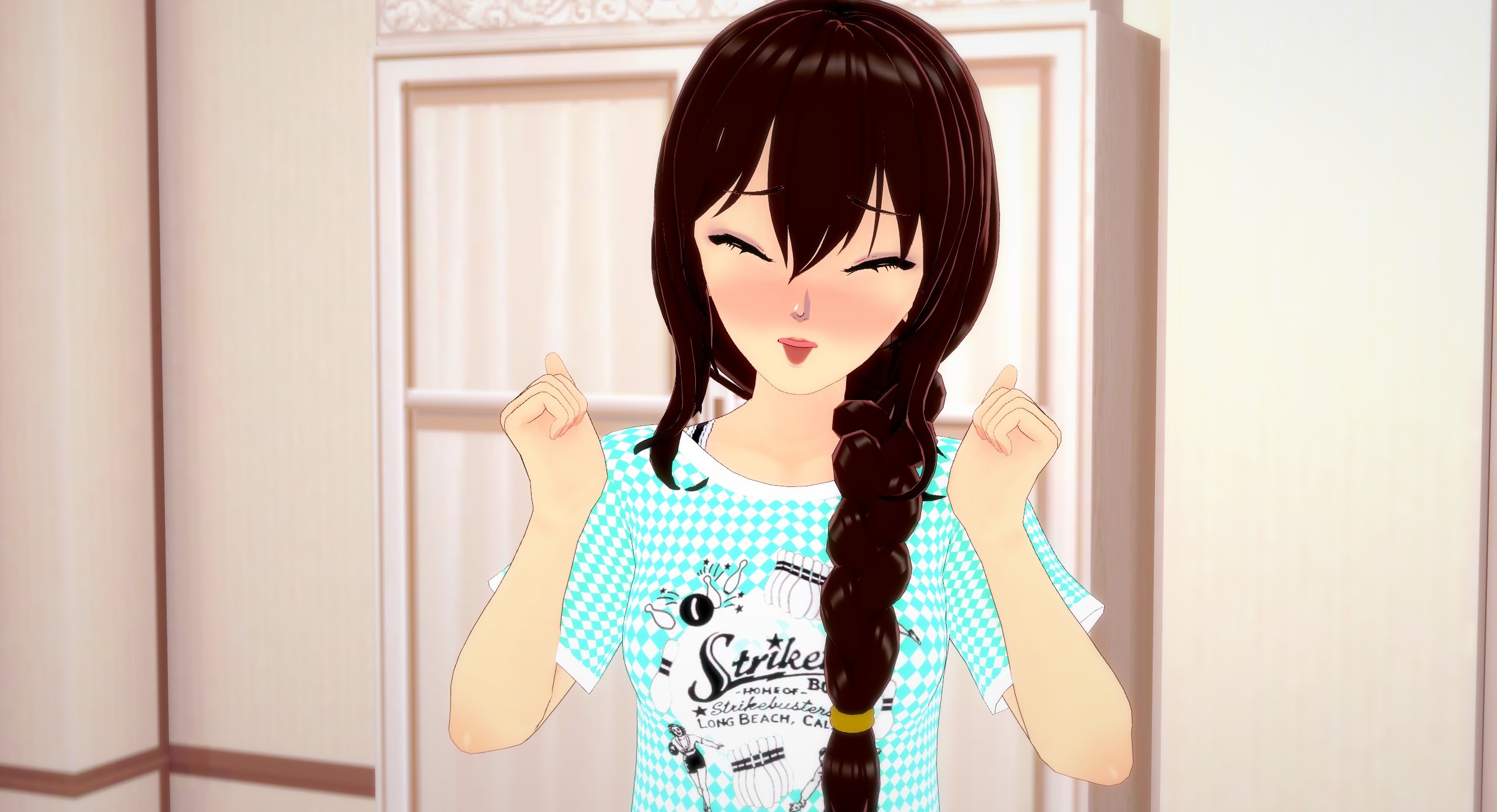
Now she conveys a sense of being flustered or worried, doesn’t she? This chapter teaches us precisely this concept: even the tiniest adjustments can completely alter the interpretation of an image. As a result, we need to consider all the intricate details and their interconnected impact.
It proves highly beneficial to consult various sketchbooks, art textbooks, drawing tutorials, or even delve into a bit of knowledge about human emotions and their physical expressions. Doing so allows us to observe the disparities in showcasing stronger or more subtle emotions. The core message I want to emphasize is that the expression of emotion isn’t limited to just one isolated body part or muscle group. Instead, our ENTIRE body collaborates to exhibit our emotional states. This transition segues us into our upcoming section.
Chapter 2: Making Poses Look Less Stiff
We’ve covered the fundamentals of enhancing our character’s animation through facial expressions. Now, let’s progress a step further by manually posing them. If your aim is a swift snapshot of your character, there’s nothing amiss with employing a pre-made pose. Actually, in certain games, users are exclusively limited to utilizing pre-made animations and poses within photo mode. These pre-made poses have their merits, yet if you possess the means to craft your own, why not utilize them? Although crafting a pose from scratch demands substantial time and effort, it infuses your picture with distinctive personality and panache. As you familiarize yourself with the process, you’ll also master the art of meticulously tailoring your composition to precisely convey your intended message, as opposed to only approximately conveying it.
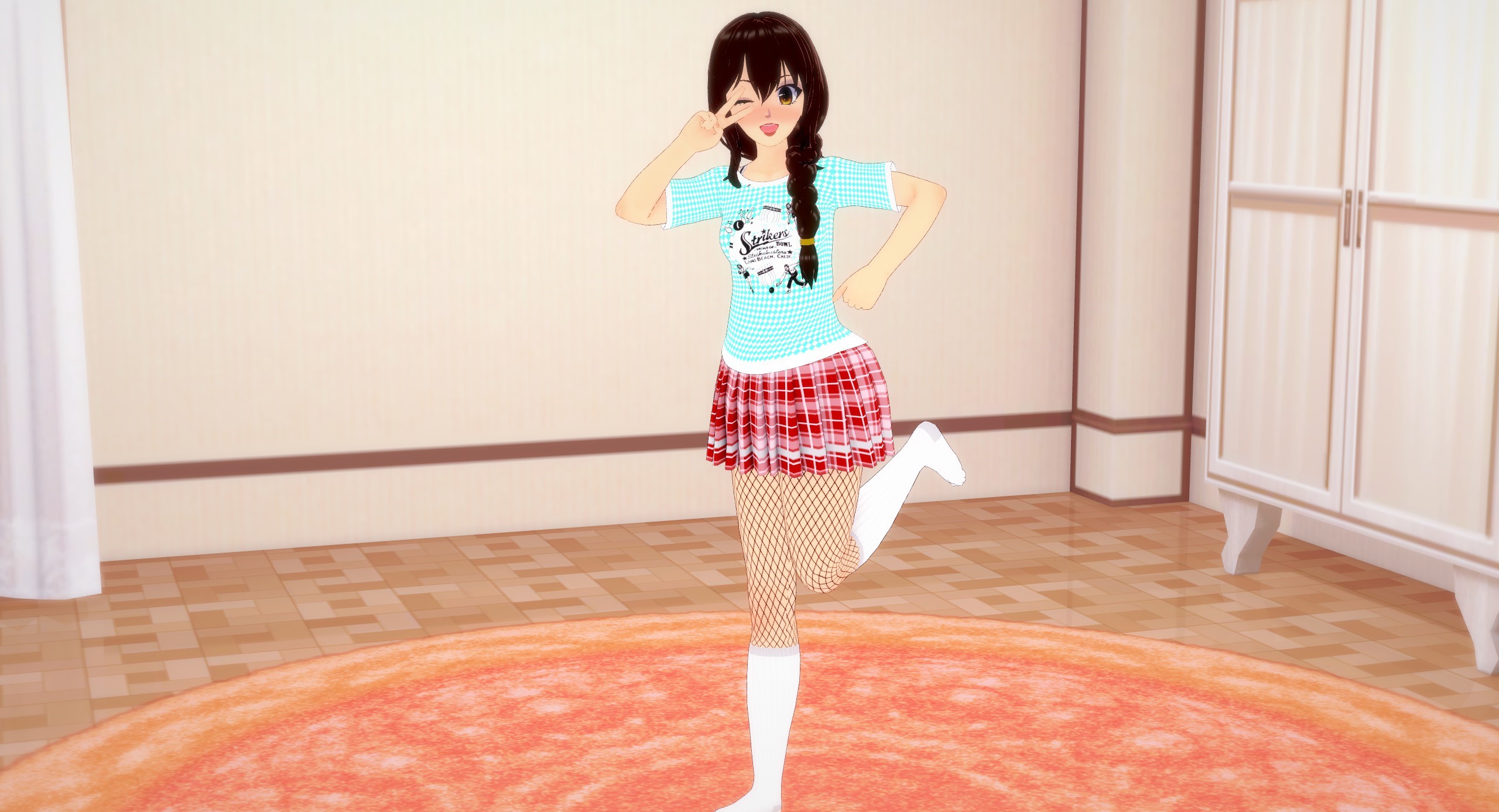
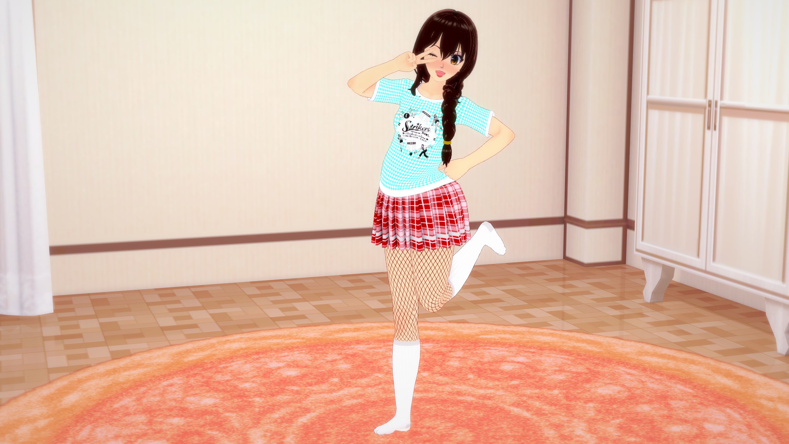
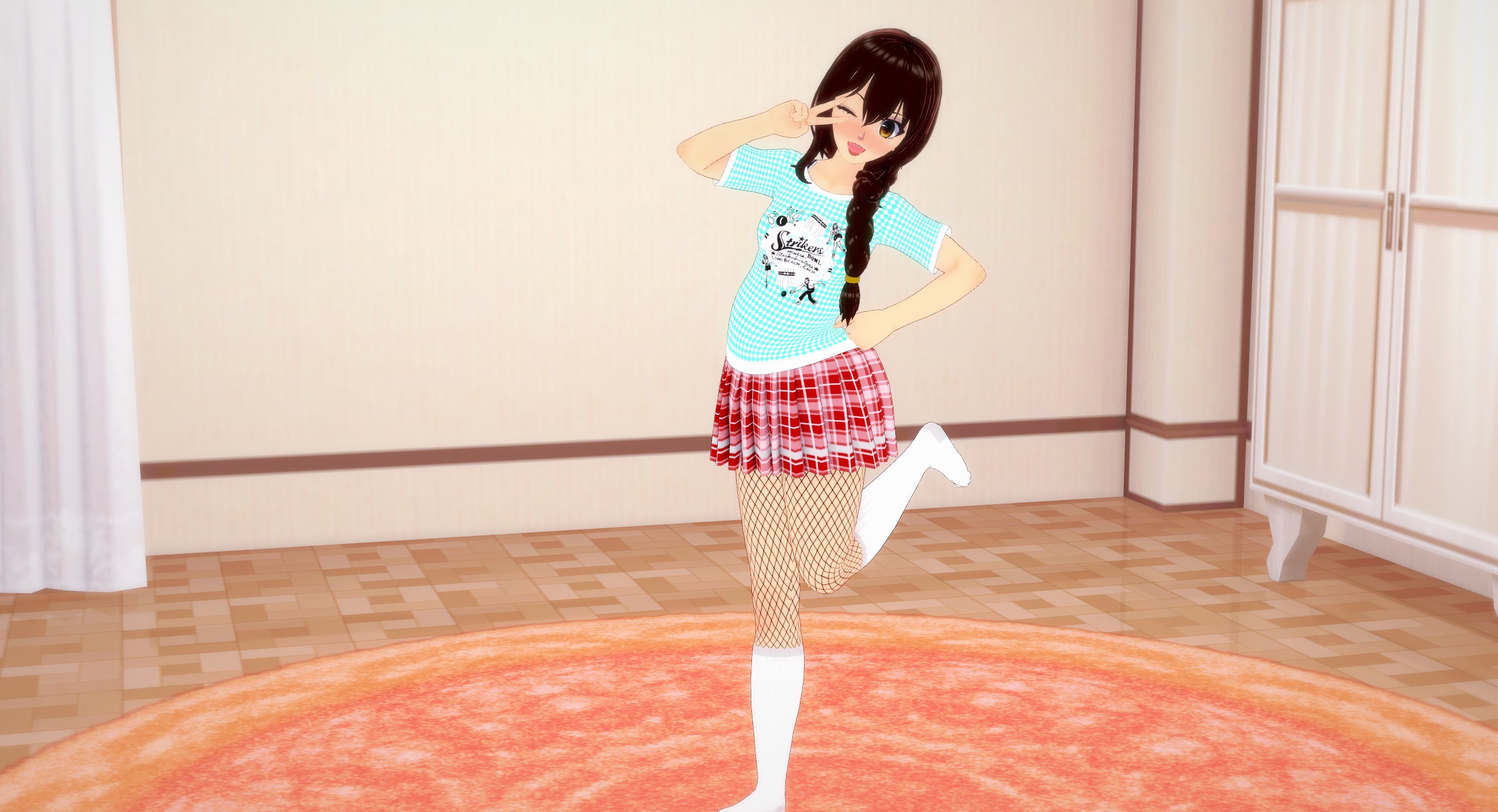
For the current illustration, I envision my character striking a somewhat clichéd yet endearing anime pose. Perhaps a wink while forming a peace sign over her face. Alright, let’s give it a shot.

This composition appears quite off, doesn’t it? While her facial expression seems appropriate, the overall result is far from satisfactory. The issue here is multifaceted. She seems disengaged, and her pose comes across as rigid, unnatural, and even uncomfortable. The intention was for her to exude a sense of enjoyment while striking an adorable pose for the viewer. However, at best, she seems to reluctantly follow instructions from someone off-screen, and at worst, she resembles a lifeless mannequin, mechanically arranged in this manner, devoid of vitality. This lifelessness, coupled with the cheerful expression, thrusts us into the unsettling realm of the “Uncanny Valley,” a phenomenon we aim to avoid. So, how can we rectify this?
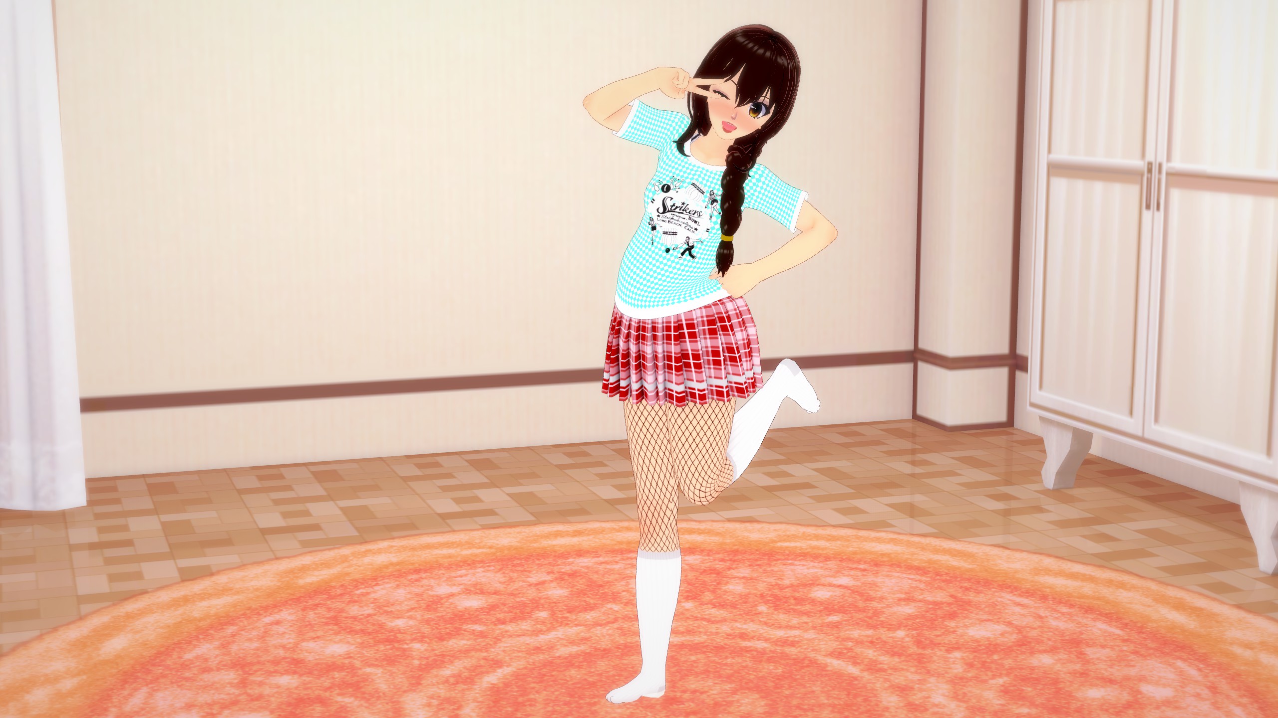
In truth, a comprehensive overhaul is in order. Let’s set aside her facial expression, as it suits the context. Since this is a deliberate pose, not a candid moment, her facial expression can appear a bit more contrived. Since the goal is to have her pose specifically for us, the viewers, we can enhance the situation by reorienting her torso and head to directly face us.
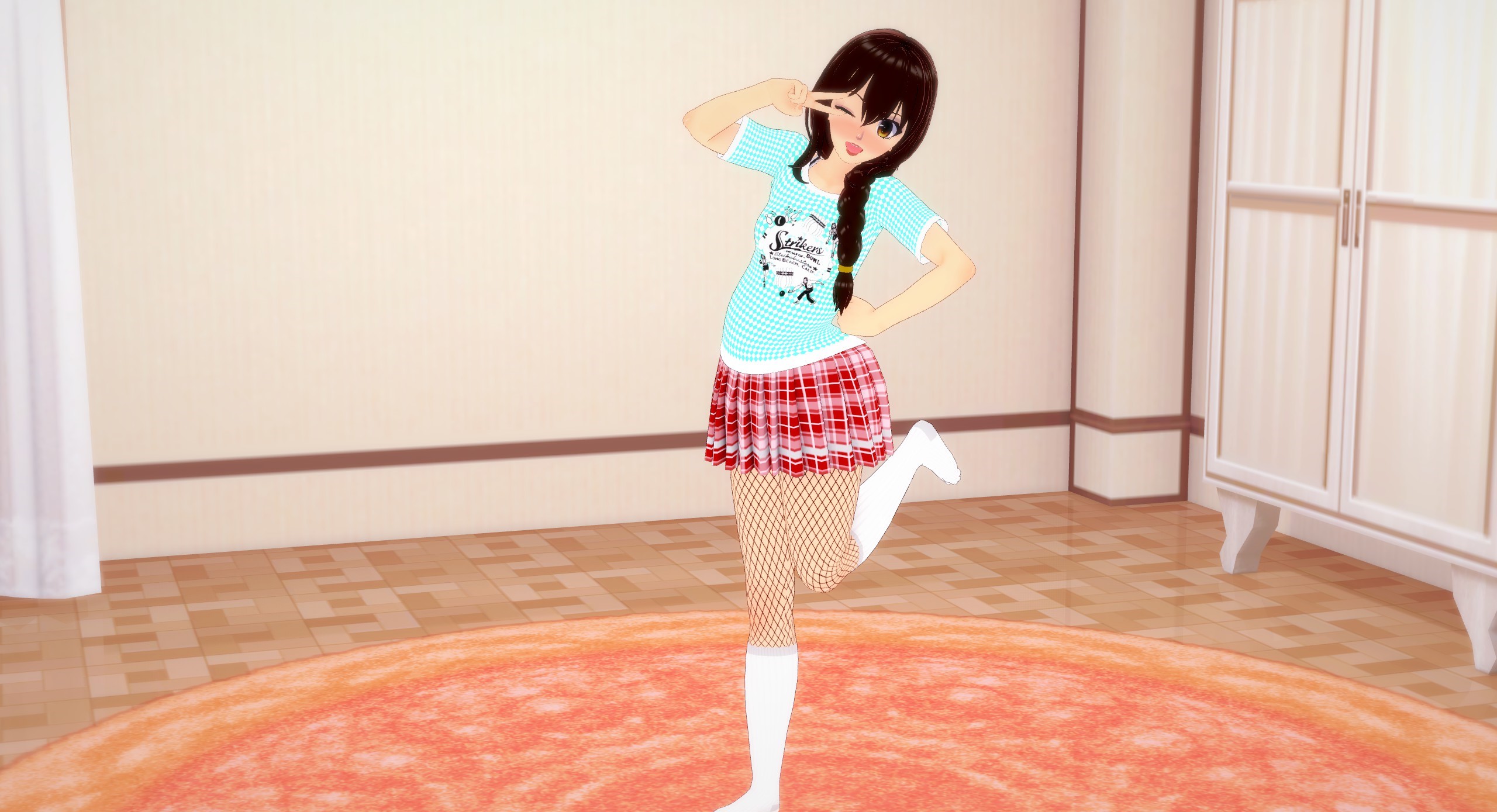
It’s showing a slight improvement, but a crucial element is still missing: a sense of weight. Considering that our bodies carry mass, they naturally gravitate towards the ground unless we actively use our muscles, limbs, or external support to counteract this force. To infuse the pose with a stronger sense of weight, let’s incorporate a tilt in her torso, angling it closer to the ground.
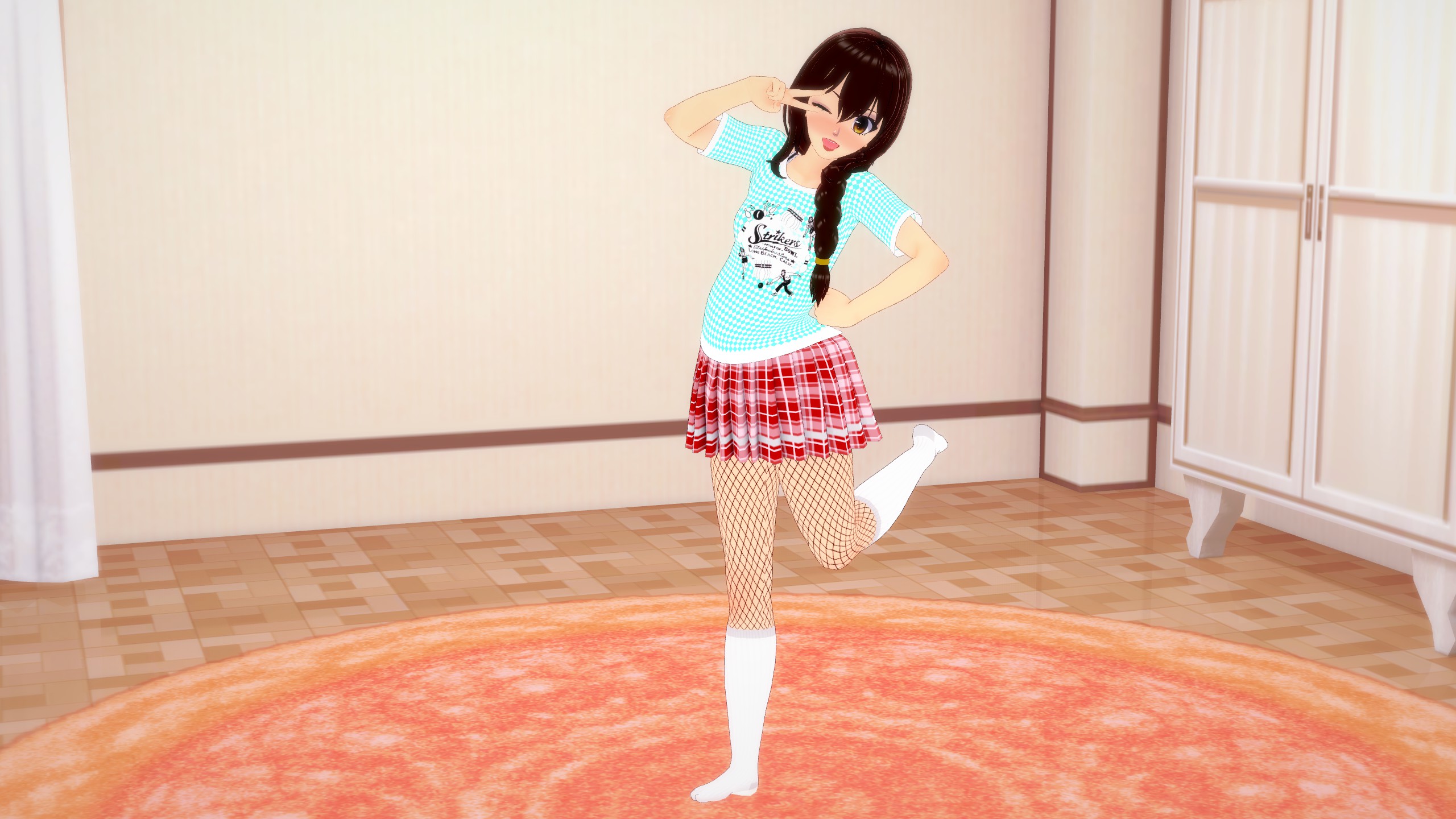
Okay. Not bad, but you know what also has a lot of weight to it? Our heads. Let’s add more weight by tilting her head towards the ground, too.
See? The pose is already a lot more lively and interesting to look at. We’re not done yet, though. Every part of our body has weight and thus, we need to express that, in the picture. We’ll start with her right arm.
You’ve observed an improvement, but what precisely was changed? Let’s delve into the underlying principles. As humans, we naturally tend to conserve energy and opt for the least exertion required. When manipulating our arms, we instinctively rely on larger muscle groups like the shoulders to carry the bulk of the effort. In this process, the forearms contribute less work, and the wrists, being the smaller muscle group, contribute even less.
Applying these insights, I adjusted her arm to enhance the pose’s naturalness. By predominantly engaging her inner shoulder, followed by the outer shoulder, her arm is positioned near her face. This design minimizes the effort exerted by her forearm, and her wrist—being the smallest contributor—effortlessly positions her hand in front of her face.
Now, let’s apply the same concept to her left arm. We can utilize her fist resting on her hip as an “anchor point” to support her forearm. This time, the inner shoulder will bear the brunt of the load, facilitating the wrist’s role in carrying the arm.
Notice how it’s a pretty subtle difference but it still makes this last shot look a lot more interesting and lively than the previous ones. Our brains notice these little differences, whether we’re consciously aware of it or not, and that’s why it’s so important to pay attention to the little details. The smallest adjustments can sometimes make the biggest differences. We’re still not done, though. Her legs still look a little unnatural.
Let’s keep what we’ve learned in mind, but also remember that we naturally will use momentum a lot, in order to move parts of our bodies. With the leg to be in that specific pose, it doesn’t make much sense that she would use ONLY her lower thigh muscles to lift her leg up. She would much more likely use the muscles in her glutes, all of her thigh and even her calf and ankle to bounce that leg up behind her so let’s go with that.
Awesome. We’re also slightly lowering her leg, at the calf, because an action like that requires a good bit of energy and muscle usage which means it would be too hard to do quickly, which is the look we’re going for; like she saw us with a camera and just quickly bounced into this cute little pose, without much thought or effort. Speaking of bounce…
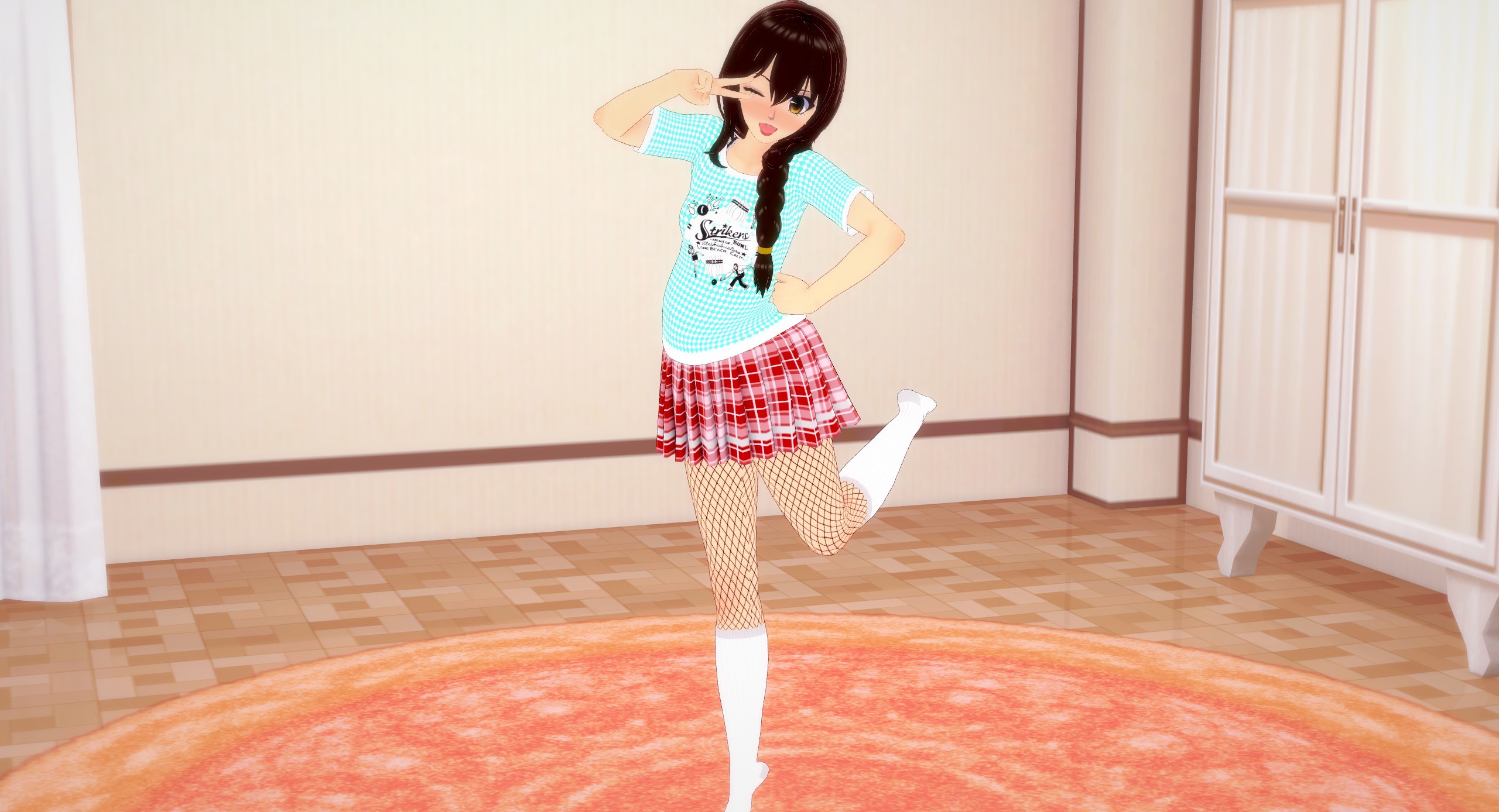
Let’s tilt her entire figure a little bit forward and bring that right leg forward to make her center of gravity more upright and balanced. We’ll also have her standing on her toes to give this shot more action. We want our pictures to look like a still shot from a video or like we caught the perfect moment, in action. A good way to check if you got that part down is by visualizing and mentally checking the character’s “Action Line”. What’s an action line?
Chapter 3: Framing Part 1: Action Line
Okay, so we’ve covered the very basics of how to make your character look more alive, and hopefully you have an idea for what can help your character feel more animated. We’re STILL not done yet, though. One thing we need to check is what’s known as our character’s “action line”. We do this by drawing an imaginary line, from our current perspective, going from the top of the character’s head down towards their feet, while staying in the middle of their figure. If we’re doing our jobs right, this line should have noticeable curvature to it and maybe even a few different curves, depending on how far out and animated we want them to look.
Let’s bring back the first picture from last chapter and check it’s action line
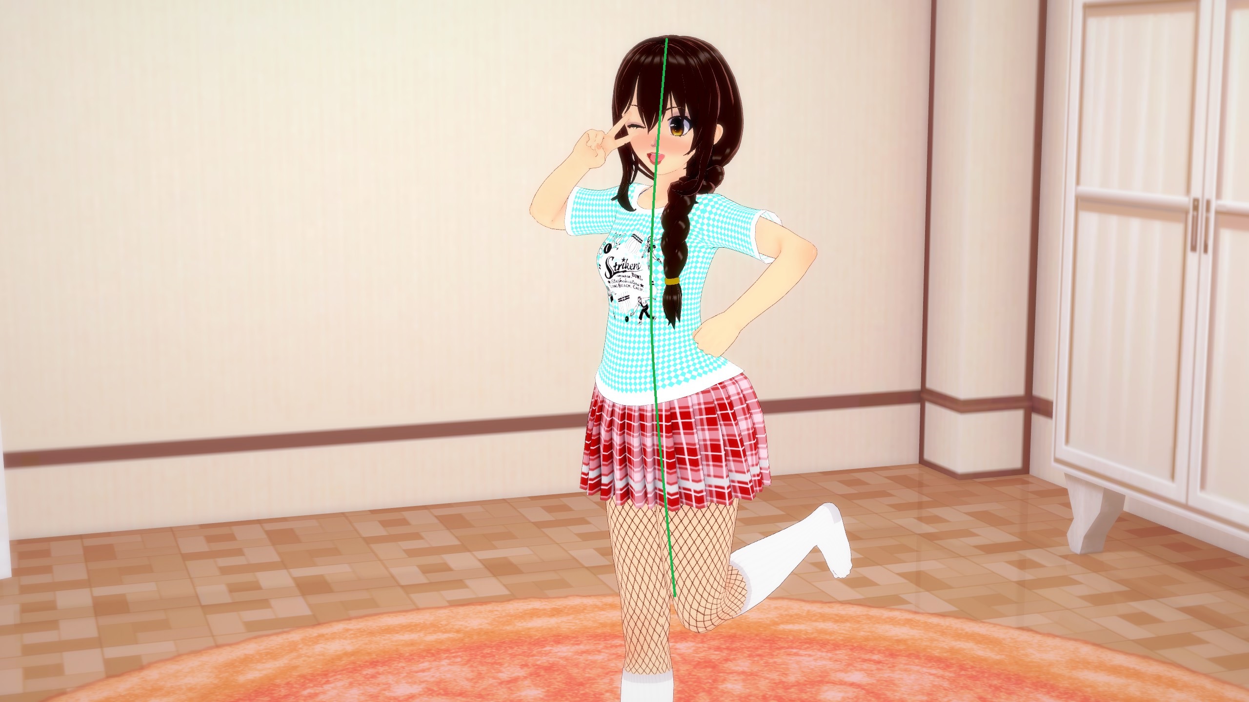
It’s almost completely straight, right? That’s a big reason why that picture looks so flat and boring. Let’s look at the action line from the picture of the fixed pose.

It’s got a good bit more curvature to it, right? But it still isn’t THAT interesting. So how can we make it look more interesting and make her pose look more animated and lively? Simply by changing the angle. Let’s see what I mean.
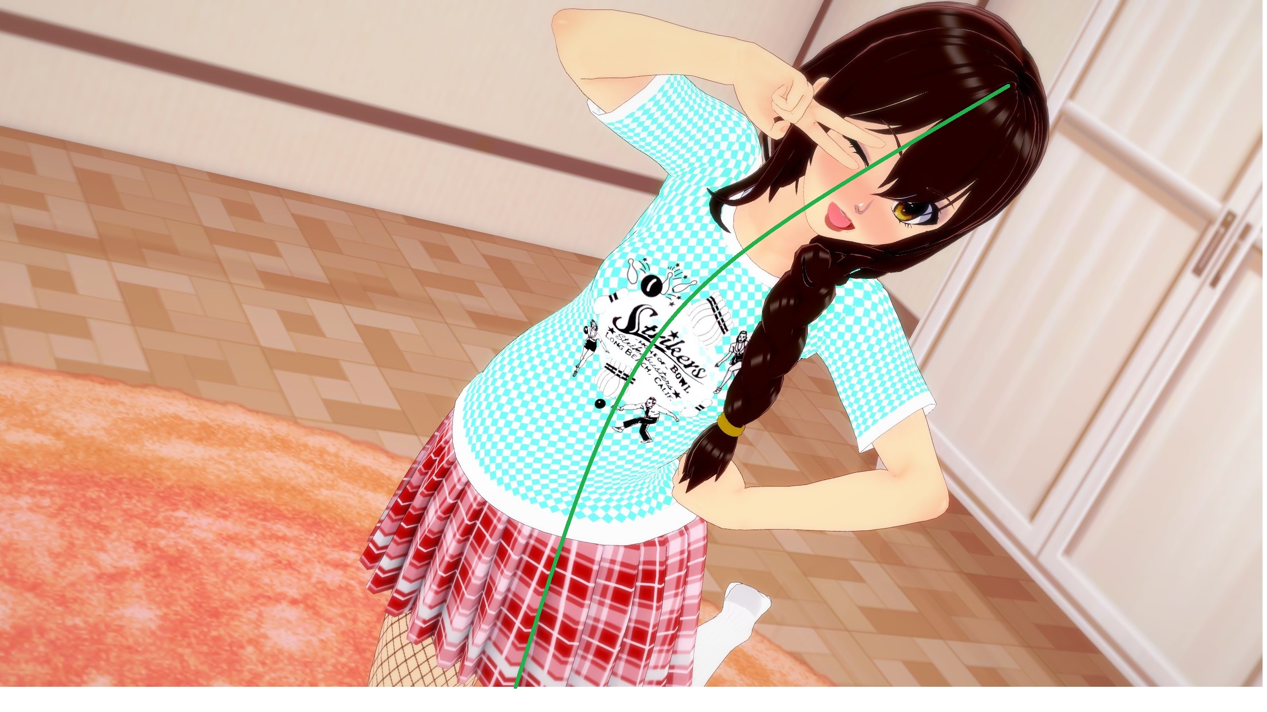
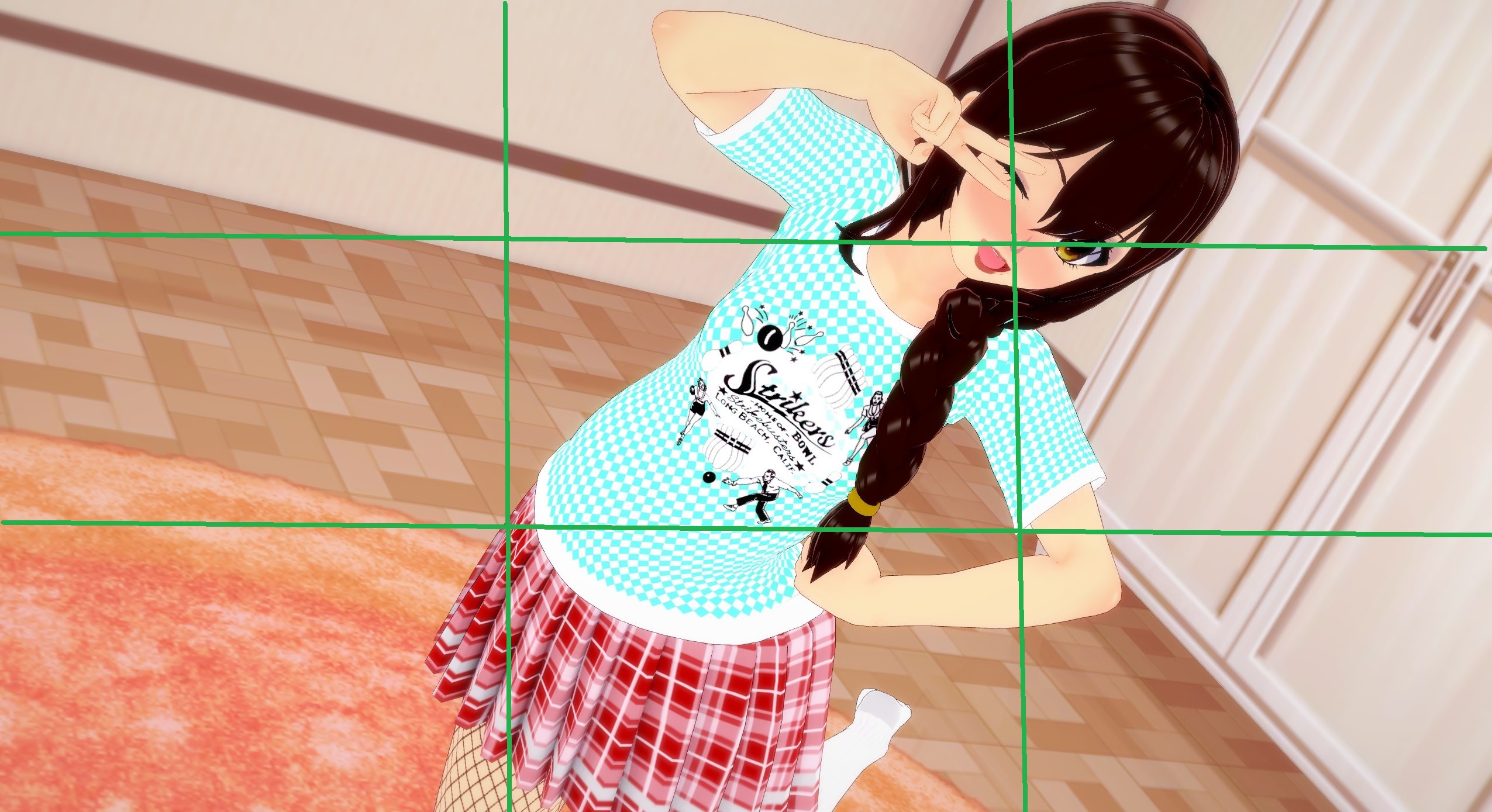
That action line has a LOT more curvature to it, now. The picture in general just looks a lot more fun too, doesn’t it? It’s because she now has a very lively pose and her action line is a lot more accentuated. We achieved that by moving the camera to an angle where the movement is maybe a little less prominent but she takes up more of the screen, making the action line have to cover more ground. It’s a nice little cheat to make for better action lines. Another little cheat to help with action lines is to rotate the camera to a more exaggerated angle, putting the top of her head and rest of her body in much different sections of the screen. Wait, sections? You mean like the rule of thirds?
Chapter 3: Framing Part 2: Rule of Thirds
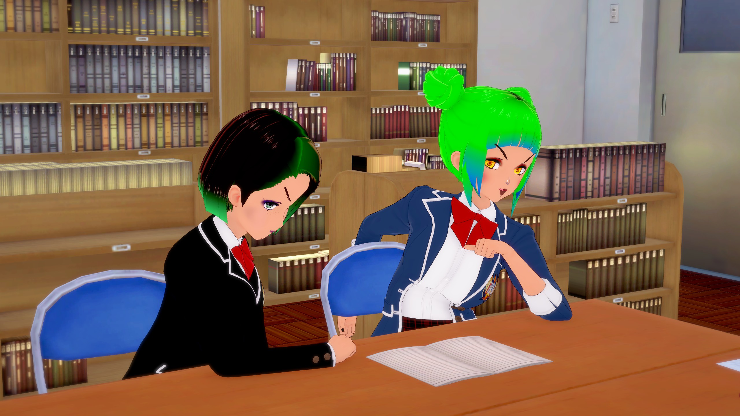
Okay, last fancy term I’ll use, in this guide. So what is the rule of thirds? It’s one of, if not the most important rules of thumb for composition. It’s the idea of breaking up a picture into a 3×3 grid and then looking at where the viewers attention is focused. Ideally, whatever is the main focus of the picture should not be directly in the middle square of this grid. We want it to be somewhere else. Let’s look at an example, using the pictures from Chapter 2 (don’t mind my poor grid drawing abilities, my point will still stand).
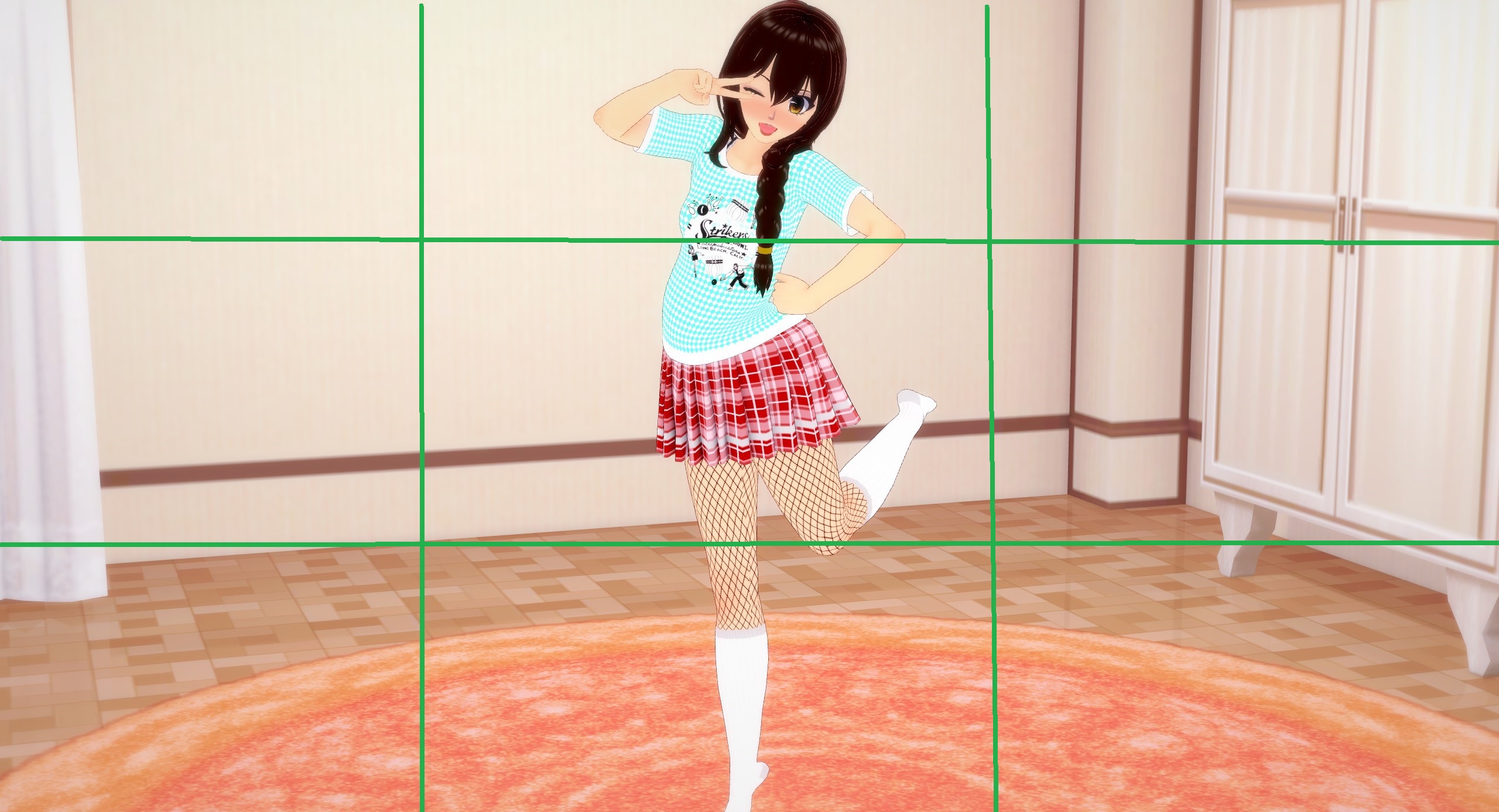
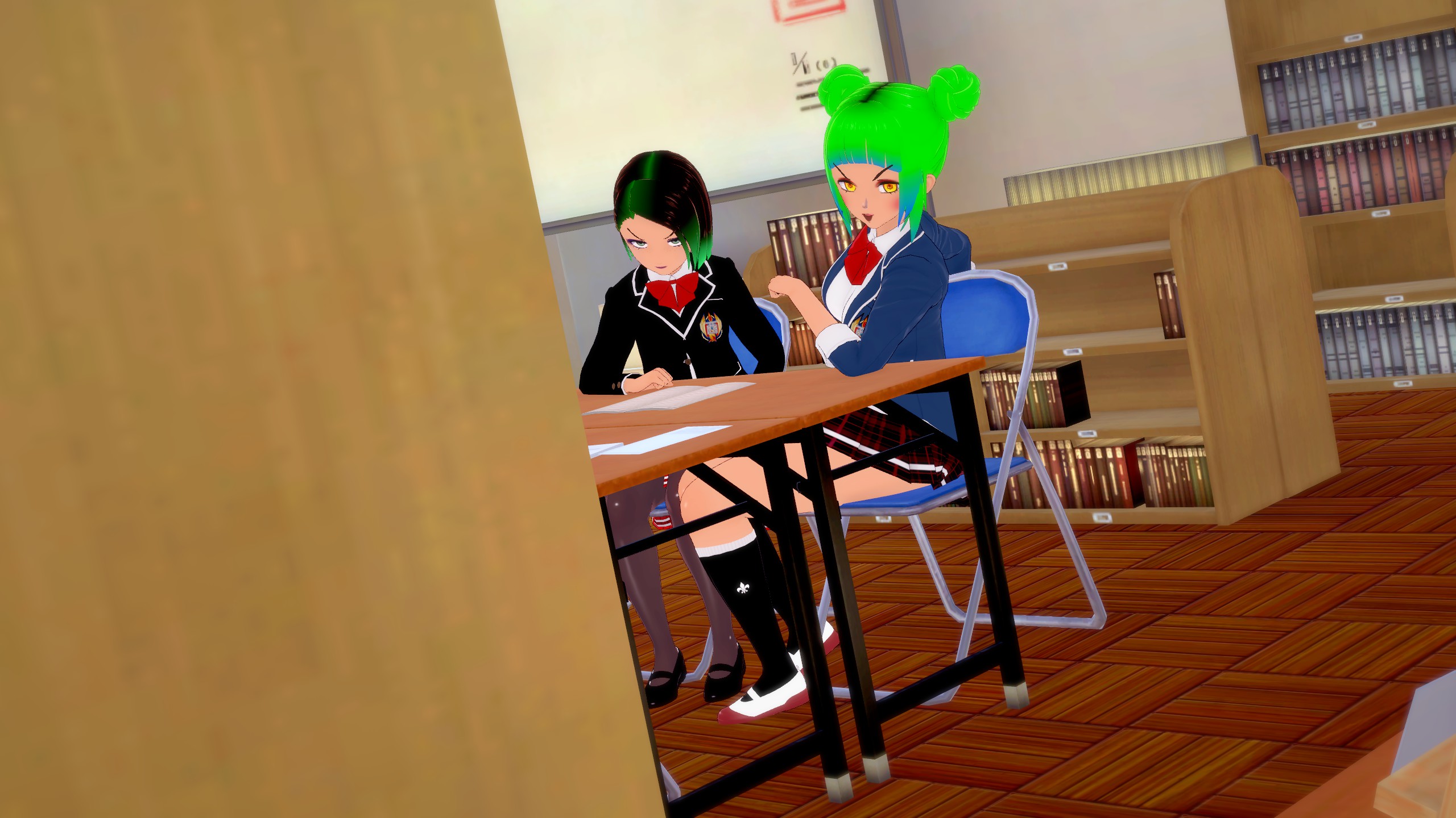
Notice how our main focus (her face) isn’t in the central square but instead up in the upper middle square? This is what I’m referring to. The composition in this picture still isn’t all that good though. Our subject is still perfectly in the middle column of the frame, leaving us with an entire left and right column of dead space. Dead space, in art, refers to any area where there isn’t anything going on or anything interesting to look at. Dead space CAN be used intentionally, to create pictures that feel lonely or show a subject looking small but in general, you want to have as little dead space as possible. Let’s look at the last picture from last section again to see a better composition, according to the rule of thirds.
See? Our main focus of this picture, her head, is mostly in the top middle and top right sections of the frame. Not only that but by zooming the camera in, we allow her to take up more of the frame which allows us to eliminate a lot more dead space, while only having the one subject.
Chapter 3: Framing Part 3: Camera Angle
The last framing trick we used to make the last shot look nicer is simply where we put the camera and how we angled it. On a basic level, if you want something to appear more cutesy, angle the camera higher, looking down to make the subject appear a bit smaller. Want the character to be more imposing? Angle the camera lower, looking upward to make the subject seem larger. Want the shot to feel more intimate or serious? Move the camera in closer to the character(s) to make us (the viewer) feel like we’re there with them. Want the opposite effect? Move the camera out further to make it feel like not even the viewer is giving our subject company. It’s not all that black and white, though. There’s a lot more subtlety to it than that, but we’re only here to cover the basics. Let’s take some pictures with what we’ve learned so far, and let’s see what each picture “says”.
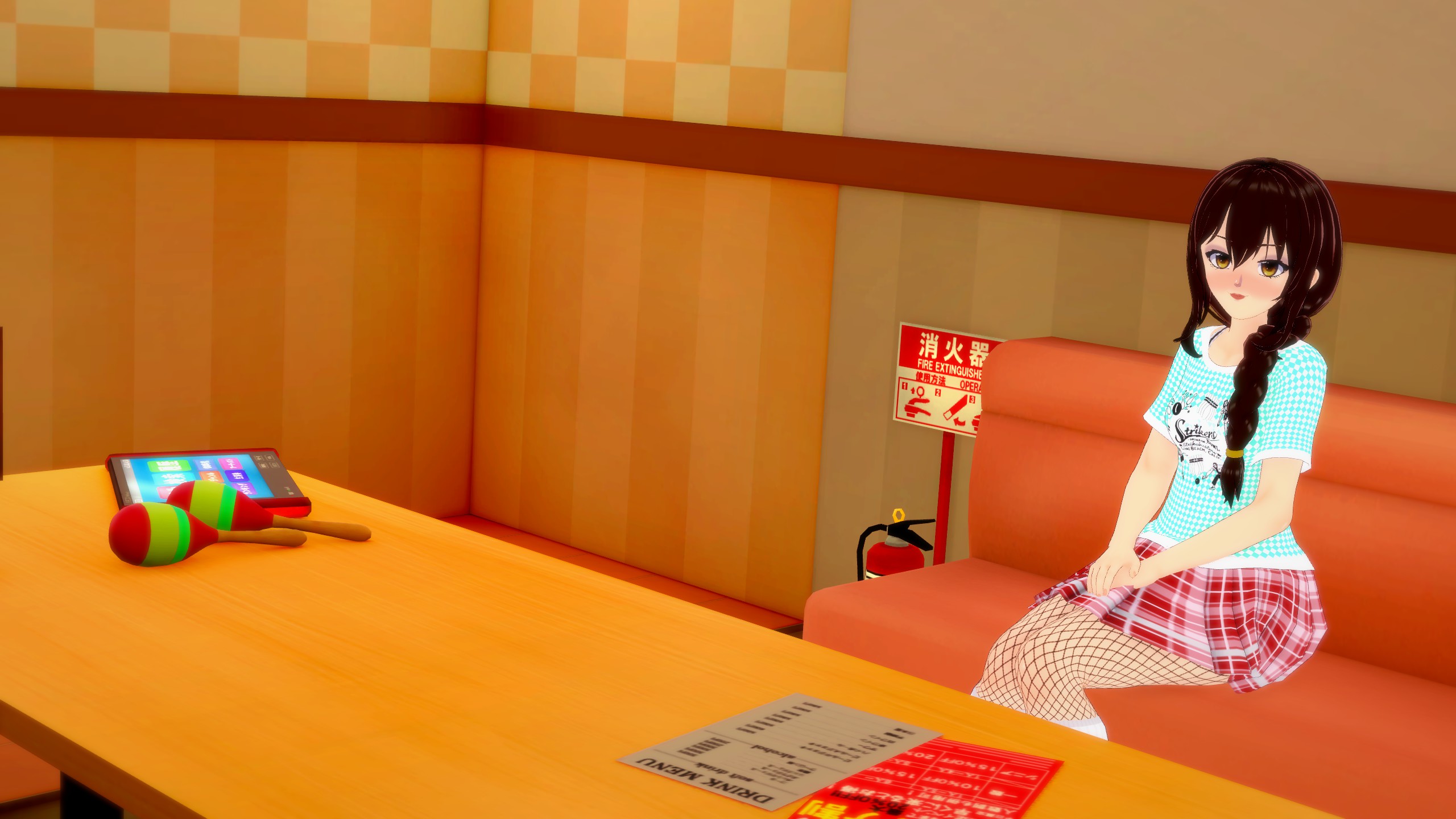
This picture says that It’s her, alone in the karaoke room. Kinda sad…
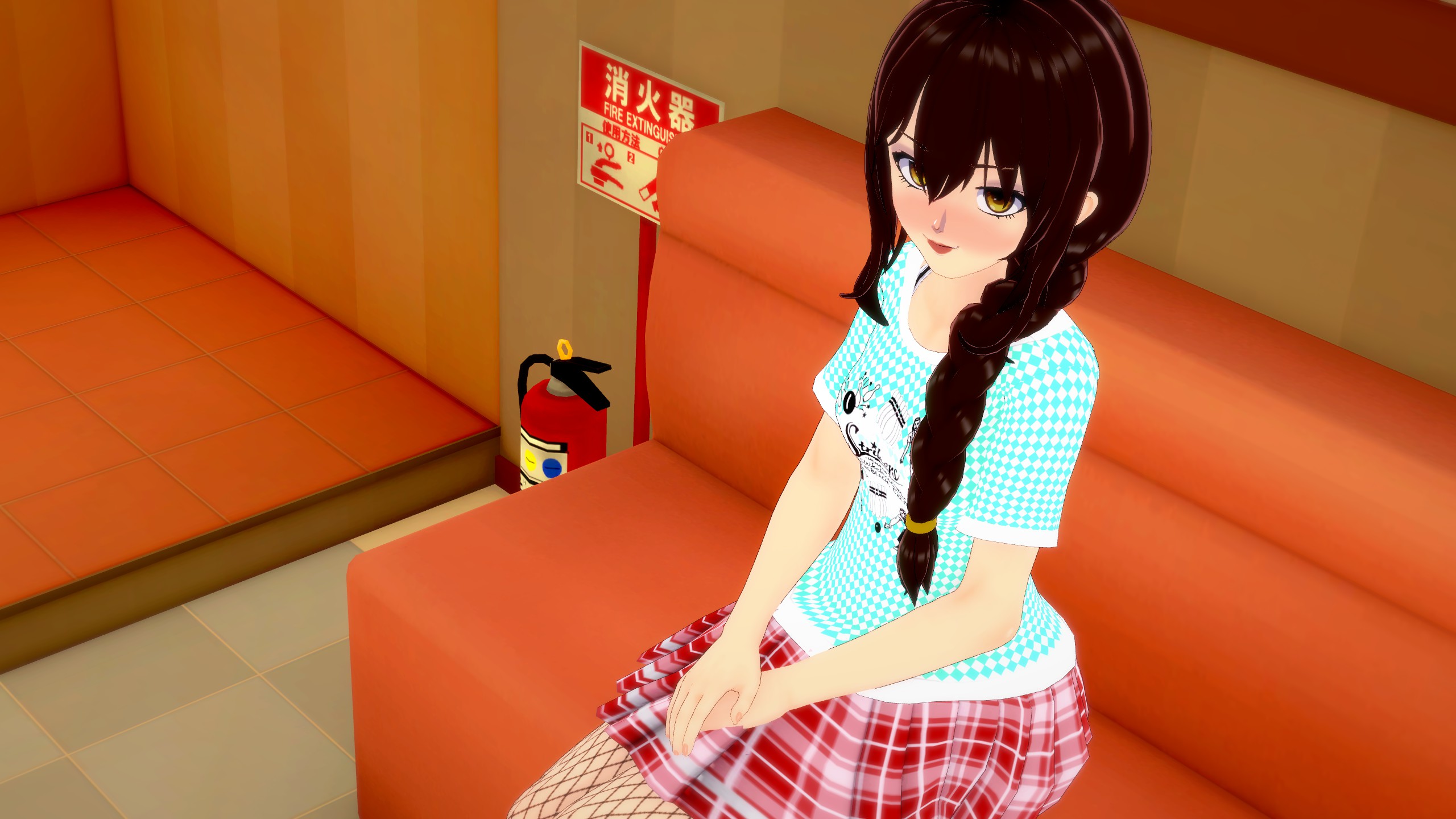
This picture says that it’s just the two of you, in this karaoke room. How romantic.
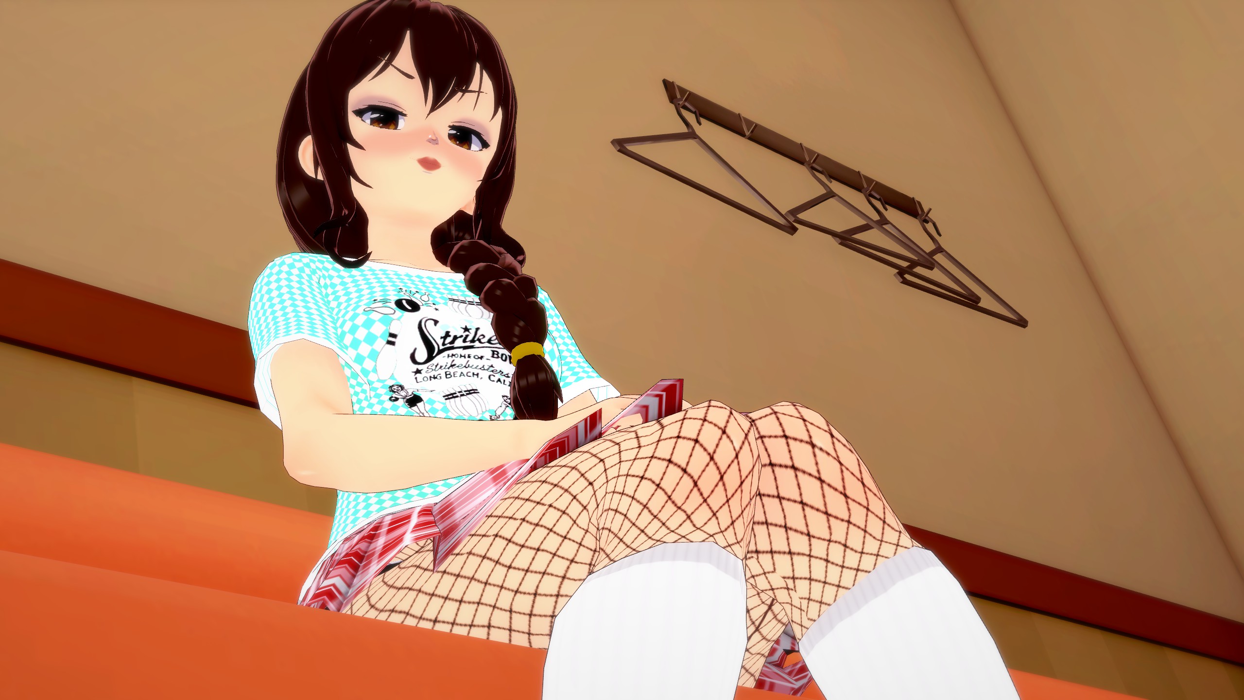
This image conveys the message, “If you fail to engage me, prepare for my intense displeasure. Is that clear?”
So, do you comprehend the message being conveyed? With merely slight modifications to her pose, we’ve effectively communicated various aspects of this character’s identity. By primarily manipulating the camera’s perspective, we’ve transformed our character’s demeanor from a solitary figure to a charming romantic interest, and further into someone who might pose a threat.
Chapter 4: Review and Outro
As we approach the conclusion of this guide, I trust you’ve begun honing your ability to identify areas that require adjustment in a photograph, as well as recognizing aesthetically pleasing elements. Let’s apply your newfound skills to some sample images. Try to identify the issues present in the initial picture, and then we’ll observe the enhancement in the second picture.
First Picture:
Facial Expressions: Good
Posing: Great
Framing and Camera Angle: Boring
First Picture Fixed:
Fixed the framing to make this picture tell more of a story. “You just got caught, peeking at the punk girls”.
Second Picture:
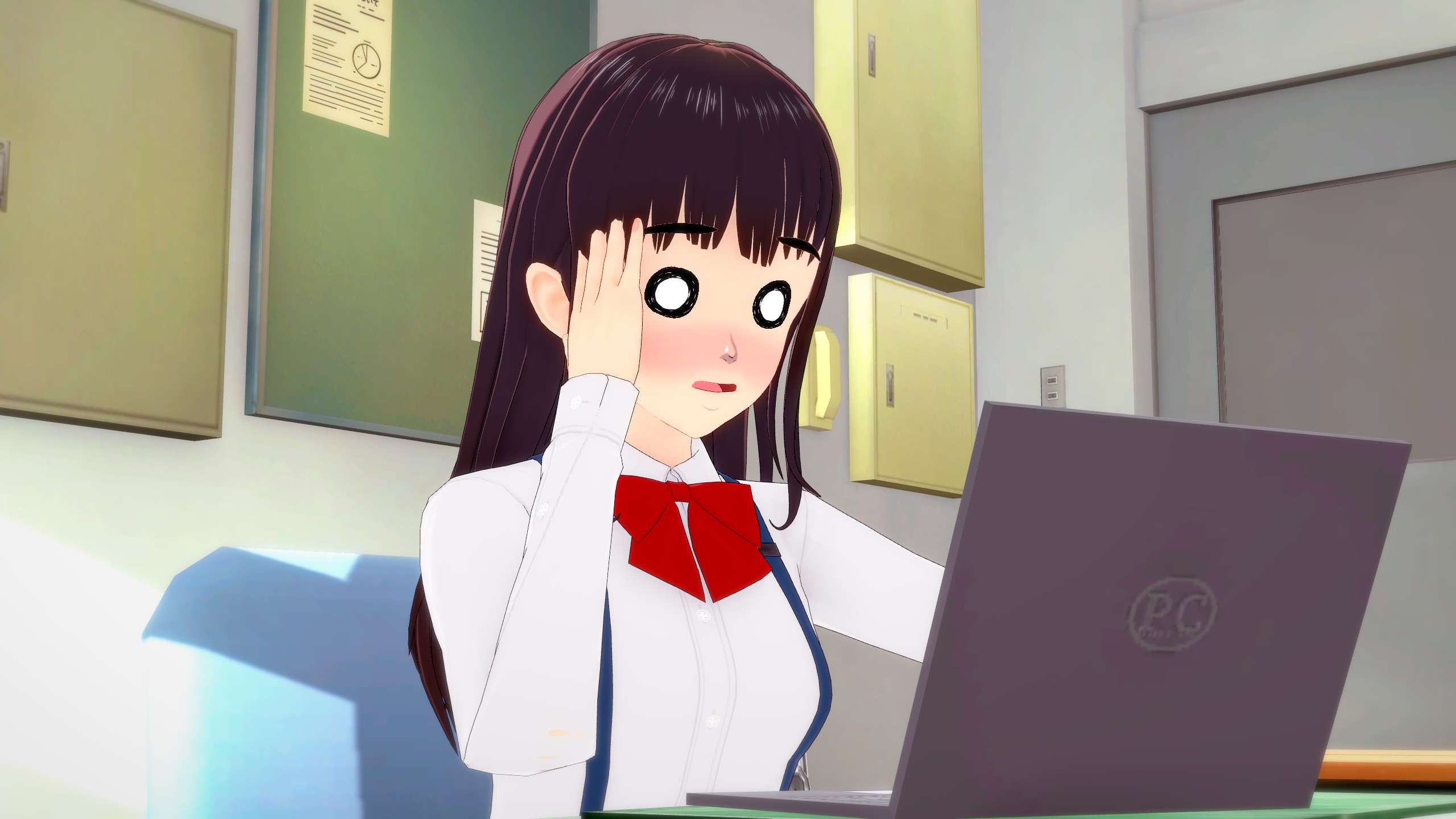
Facial Expression: Great
Posing: Awful
Framing and Camera Angle: Average
Second Picture Fixed:
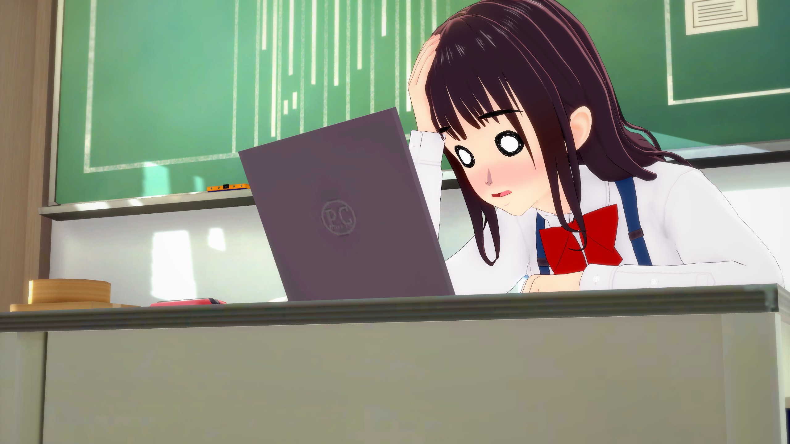
Better framing and her exaggerated pose really emphasizes how much she’s struggling with that laptop
Third Picture:
Facial Expression: Boring
Posing: Good
Framing and Camera Angle: Good
Third Picture Fixed:

A smile suffices, but given the character’s dynamic and attention-grabbing appearance, it doesn’t quite align. Why not infuse more excitement by having her execute a playful wink and blowing a kiss?
With this brief trial, my time here concludes. I trust this guide has provided you with some additional insights into the realm of art. If you’ve gleaned even a fraction of knowledge, I encourage you to embark on capturing images or screenshots. Feel free to share your creations with me. I’d be delighted to view your characters and offer feedback. Remember, art thrives on expression, so once again, embrace the opportunity to express yourself out there!
That's everything we are sharing today for this コイカツ! / Koikatsu Party guide. This guide was originally created and written by PenguinOfTheSands. In case we fail to update this guide, you can find the latest update by following this link.